-
Using the favorite website you chose in homework 1, create a wireframe for one page of it using pen/paper, PowerPoint, or any your tool of choice. (use the 'img' tag!) Make sure to let us know what the name of your website is (Use the 'p' tag!)

-
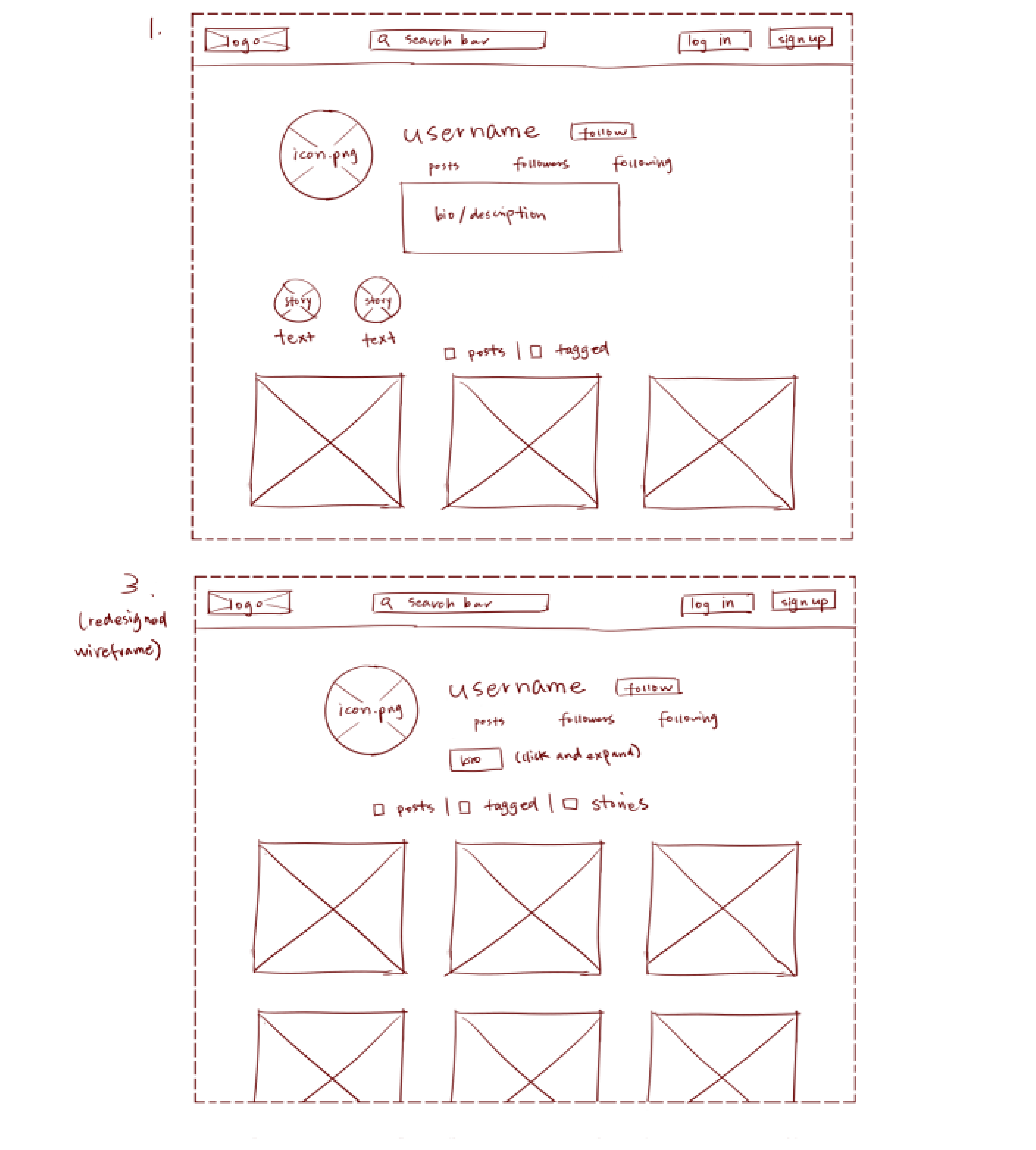
Try to improve the website you've chosen, and create a redesigned wireframe of one page for the same website using the principles of visual hierarchy that you learned from the article.

-
What is the goal of the website? Who is it intended for? How does the design accomplish this? Write 2-3 sentences answering these questions. (Use the 'p' tag again!)
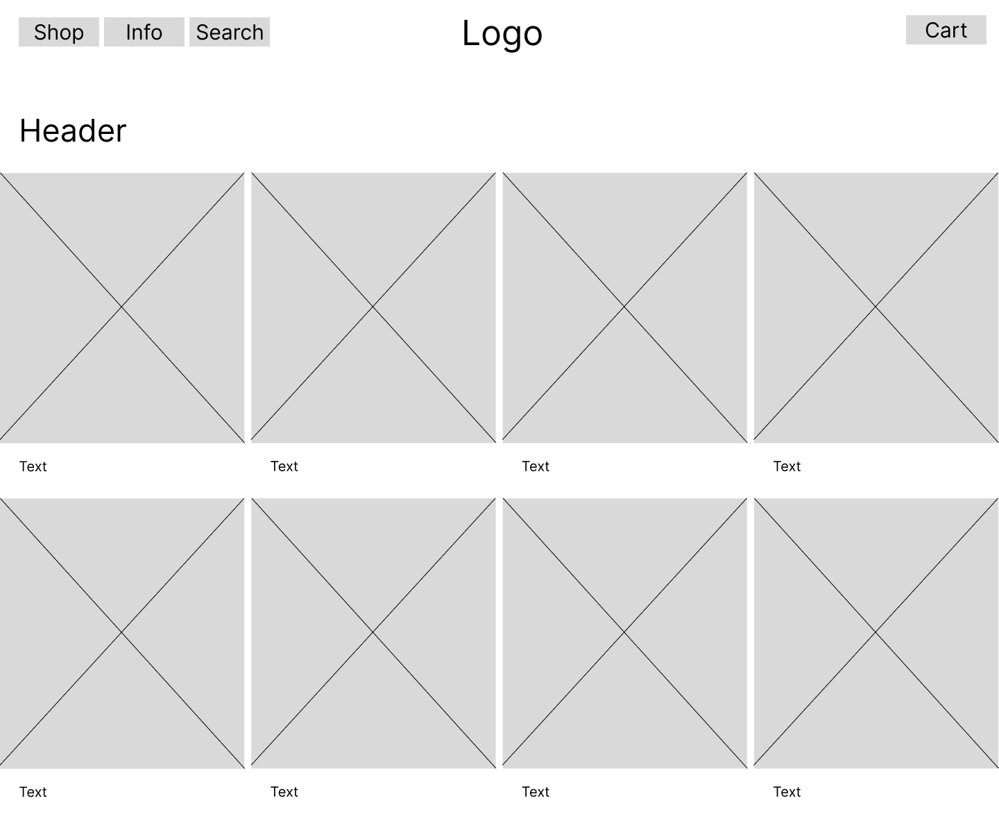
This website is an e-commerce platform with a browseable storefront. The goal is for the user to select products and purchase them. The design accomplishes this by displaying a simple and easy to navigate website.
-
Write 2-3 sentences about what problems your redesign addressed, and how it solved them.
A problem when browing the storefront is that the image size is too wide and spans across the whole page, directing the focus on too many products at once, making it harder to view a specific one. In my redesgin, I fixed this by making the display images smaller and additionally switching up the nav bar to be easier to navigate and locate specific buttons for a certain action.
NOTE: Make sure to include the wireframe images in the website and don't just put it in your assets folder!
Your wireframes should look something like this:
